Hi!
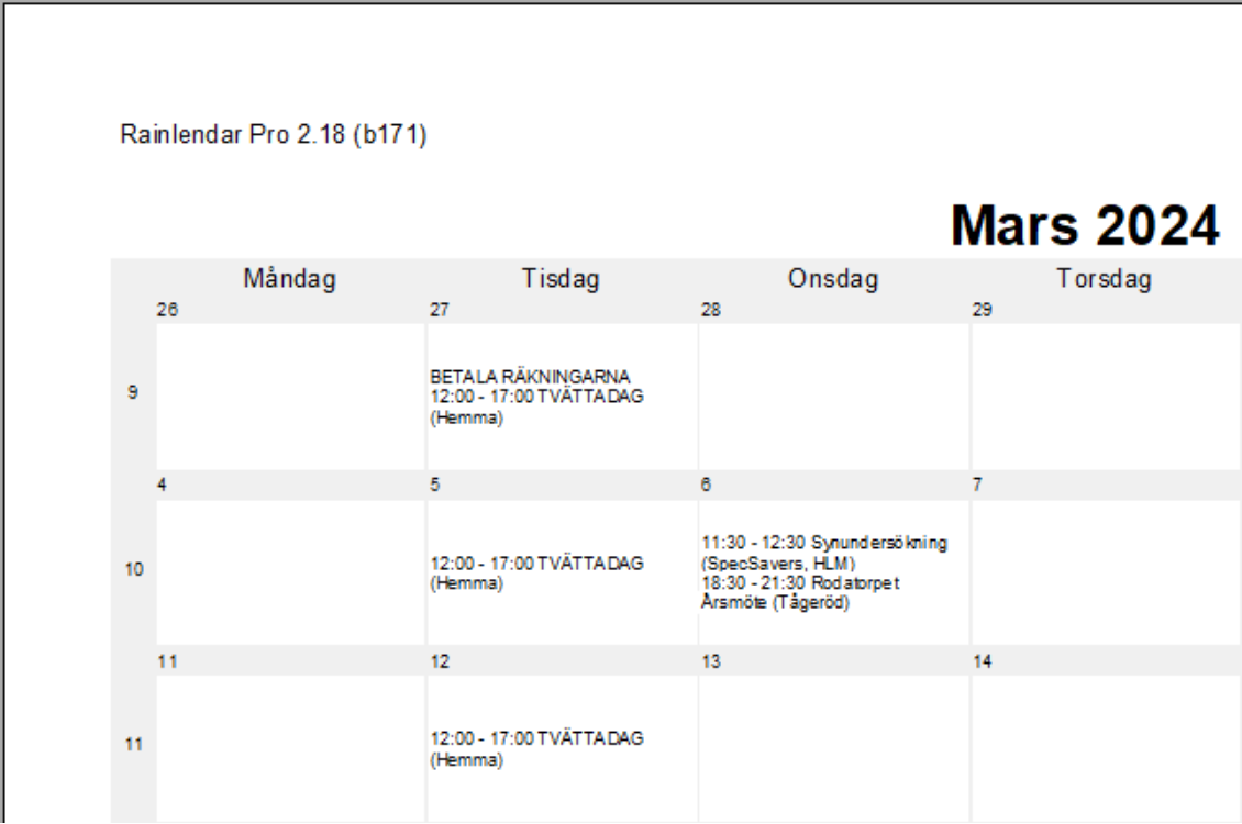
The embedded image shows how a month page is displayed om my computer in the print preview. Not a problem, but the week numbers are far too similar to the date numbers and can be confused with them. This becomes even more apparent when I do a printout on paper on my HP Envy 6000. The gray shading to separate the weeks and week numbers is so light, it is almost non-existent!
I would therefore like to suggest that:
-
the week numbers are larger than they are now, also preferably in a bold font. Even the date numbers could be a bit larger.
-
The grey shading to be a little darker or at least let the actual printout match the preview.
-
to make it easier for the user and to adapt to different printers, give the user more printer settings (e.g. lighter/darker) and/or the possibility to advanced settings like the screen display has, so the printout can be better adapted to the printer/user.
Thanks in advance!
![]()
/MacD